Spendifique
Spendifique is an early-stage fintech product developed by Fingarde, designed to help small business owners and founders manage expenses without formal accounting knowledge.
Full Case Study
Deliverables
3C Analysis
STP
Survey
User Interview
Persona
User Journey Map
UI/UX Design
My role
Team Lead
Product designer
Duration
5 weeks
Team
3
Challenge
Small business owners and founders often manage expenses without formal accounting training, which makes jargon-heavy financial tools overwhelming and time-consuming to use. Many spend excessive effort on repetitive tracking without gaining meaningful insight into their finances.
At the same time, Fingarde needed to validate assumptions about user needs while preparing for a beta launch, improving onboarding and dashboard usability without compromising a simple, modern, and non-intimidating design language.
Methods
I started by interviewing founders to understand how they currently track expenses and where existing tools break down in real workflows.
From these insights, I translated user pain points into clear design priorities, focusing on reducing financial jargon, clarifying information hierarchy, and making expense data more actionable.
I iterated on low-fidelity prototypes and validated design decisions through usability testing, refining the product experience to better match users’ mental models and day-to-day needs.
Outcome
The redesigned experience reduced time-to-understanding by approximately 35% and enabled 75% of users to identify clear, actionable next steps. Guided onboarding decreased initial confusion by around 40%, while community-based benchmarking increased user confidence in performance evaluation for over 60% of participants. Overall, the changes led to greater engagement, with users 1.7× more likely to explore insights beyond surface-level metrics.
UI/UX Design
Fintech


Context
Spendifique is an expense management MVP developed by Fingarde, it aims to become an intelligent business assistant that automates repetitive financial tasks for small business owners. At the time of this project, Spendifique had a working MVP and early beta users, but no formal UX research had yet been conducted. Product decisions were primarily guided by internal CPA expertise, creating a timely opportunity to introduce user-centered research to help shape the product direction before public launch.
Design Process
3C Analysis
Company
Customer
Competitor
STP
Segmentation
Target
Positioning
PERSONA
USER JOURNEY MAP
SURVEY
INTERVIEW
AFFINITY DIAGRAM
UI & UX DESIGNS
DISCOVER
DEVELOP
DEFINE
DELIVER
3C Analysis
To better understand the company’s needs and define the design scope, I conducted a 3C analysis to examine the Company, Customer, and Competitors, through meetings with the client and desktop research.
Core Value
Provides small business owners with an intuitive and approachable UX to easily understand and manage their financial situation
Different Points
Uses clear visuals and simple language instead of complex accounting terms
Frames the service as “money management” rather than “financial management” lowering the entry barrier
Current Challenges
Designing onboarding processes that account for small business owners’ low digital literacy
Company
Customer
Primary Target
People with limited accounting/finance knowledge who find external accounting services too costly
Needs
Want a clear overview of cash flow
Check expenses at a glance
Avoid accounting jargon
Generate simple reports
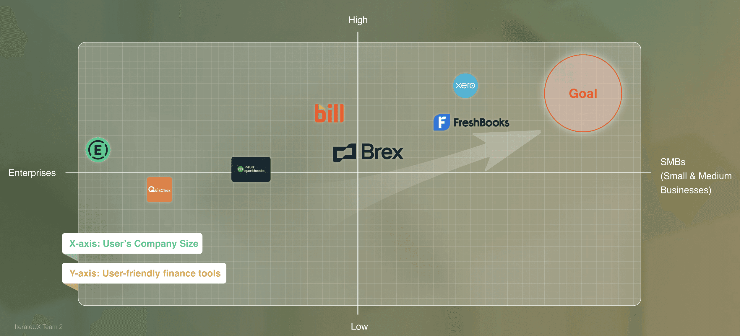
Competitor
Expensify
Product Focus
Strengths
UX / Product Gaps
Bill
Brex
Xero
Interface is dense and workflow-heavy
Limited guidance on how to interpret spending data
Designed primarily for accountants
Steep learning curve for non-expert business owners
Insights focus on tracking and control, with limited support for reflection or decision-making
Data-heavy dashboards assume financial literacy
Lacks contextual or actionable insights


Expense reporting & reimbursement
Accounts payable & financial operations
Corporate card & spend management for startups
Cloud accounting for small businesses
Strong automation for receipts and reimbursements; widely adopted
Robust controls and compliance for finance teams
Clean UI and real-time spend visibility
Comprehensive accounting features and reports
STP
Following the STP framework, I target Small Business Finance Users as our primary user group, since they manage financial decisions daily but often lack the time, tools, or financial expertise to interpret complex expense data and translate it into actionable insights.
Key Insight
Users can see their expense numbers, but struggle to understand whether their spending is “good” or “problematic” without a clear reference point.
Positive peer comparisons reinforce users’ sense of control and competence, while negative comparisons can cause anxiety or avoidance if presented too bluntly.
1
3
2
Users prefer concise, takeaway-driven feedback over detailed financial charts.
User Journey Map
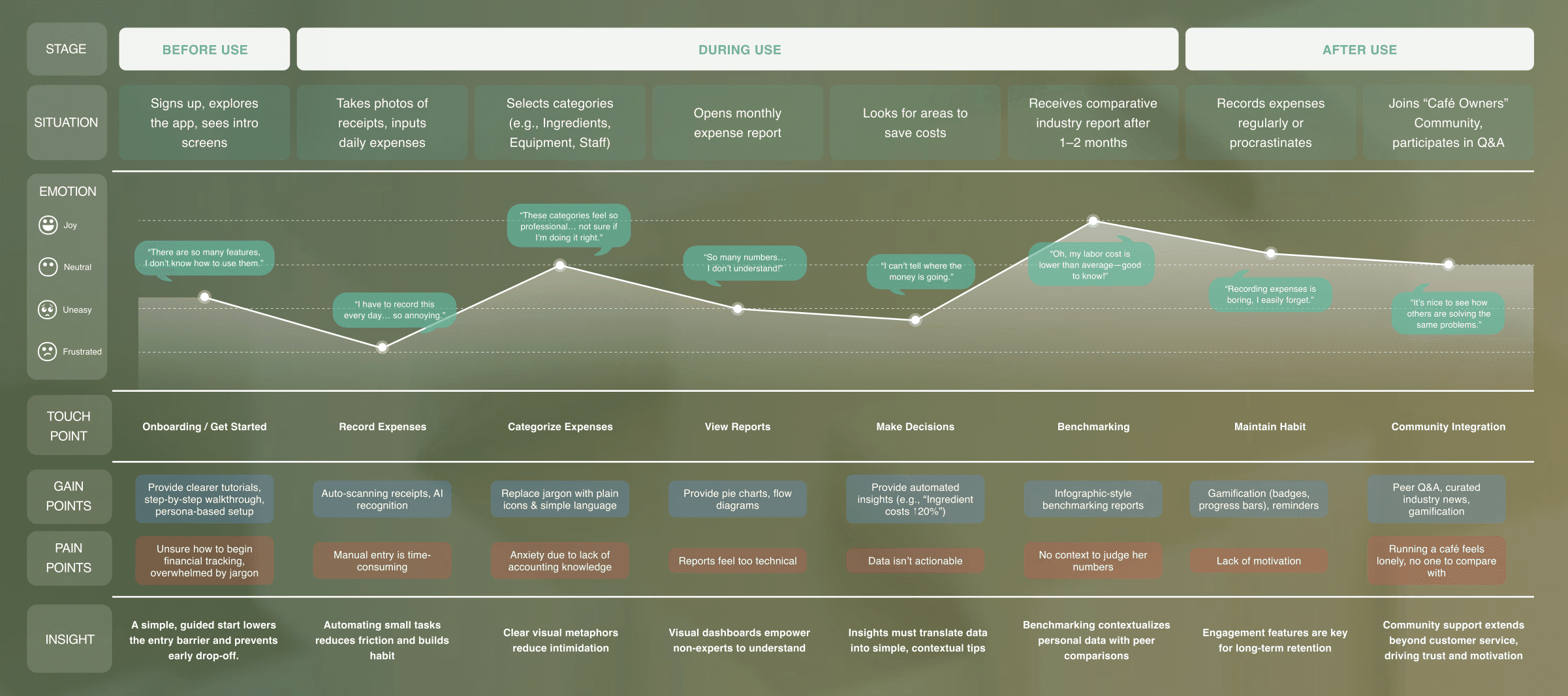
After gathering the initial insights, I led a User Journey Mapping workshop with my team of three to identify persona, goals, scenarios, and steps for users logging in with Spendifique. The workshop helped visualize the process.
The shared vision from the mapping session helped communicate and understand users and became the basis for decision-making. Understanding user needs was critical in informing the design and creating a clear plan for our design direction.
Problem Statement
How might we make financial management easy, enjoyable, and social engaging?
Design Direction
Needs
Offers
IDEAS
Clear, step-by-step guidance
without jargon
Not just numbers,
but clear suggestions for decisions
Stay engaged and supported
when managing finances
Persona-based tutorials
Plain language & visual icons
Automated tips with UX Writing
(e.g., “Ingredient costs ↑20%”)
Fast support by peer community
Onboarding with
Explanation
Actionable Insights
Motivation & Support
Hi-fi Prototype
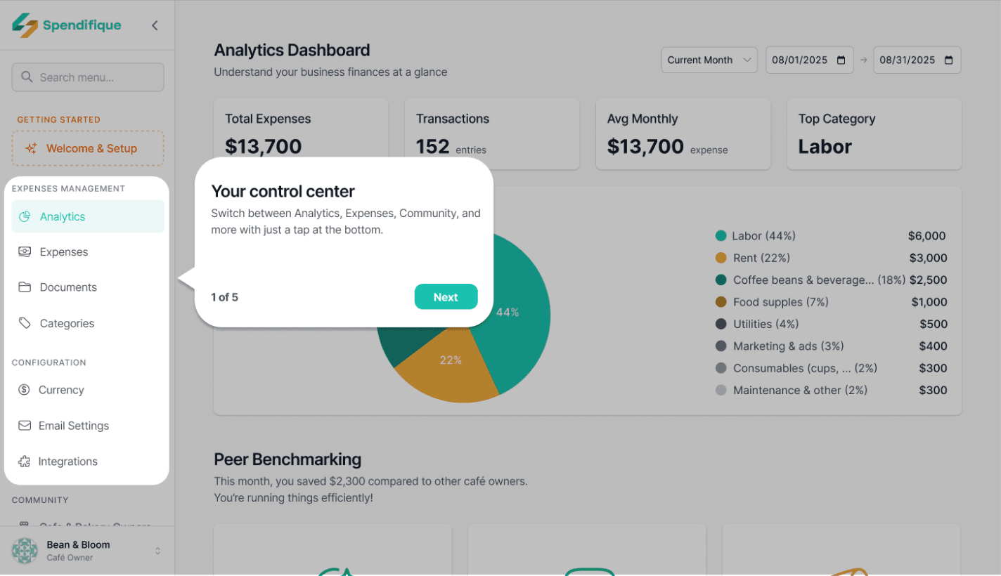
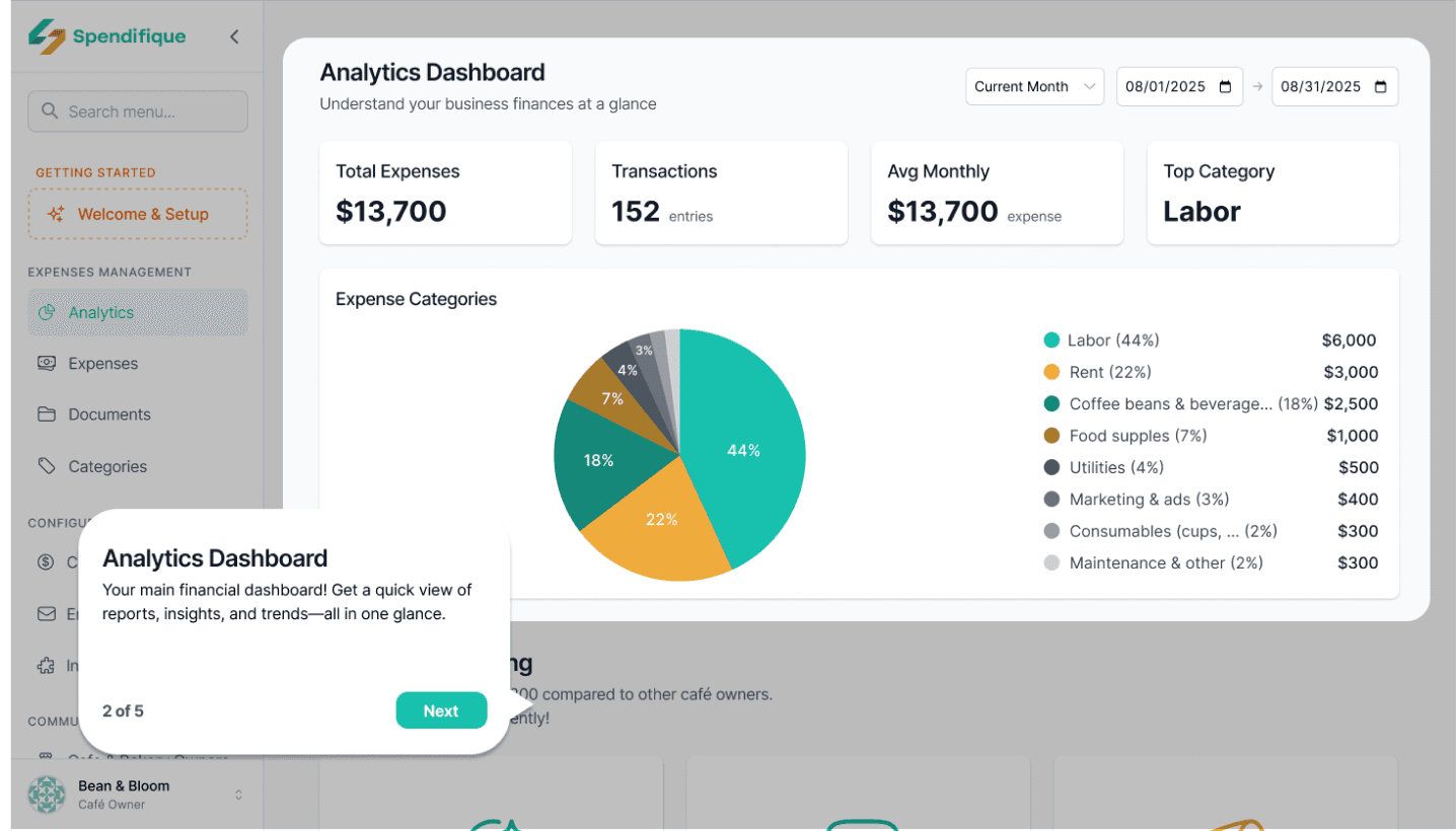
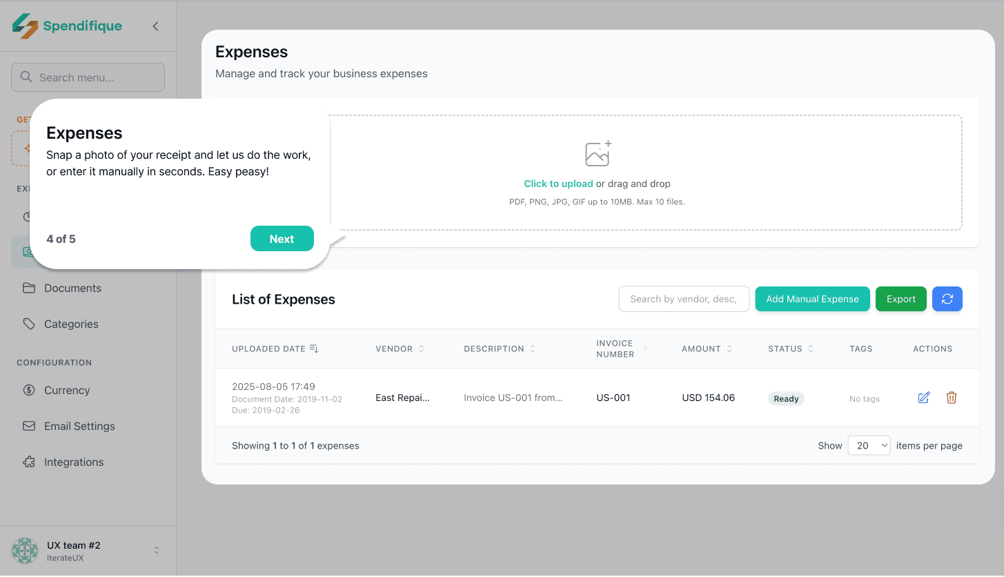
Onboarding tutorial
The tutorial introduces Spendifique’s core functions in a simple and friendly way. The tone is light and approachable, so even users who are new to expense management can quickly understand how to use the app without feeling overwhelmed.
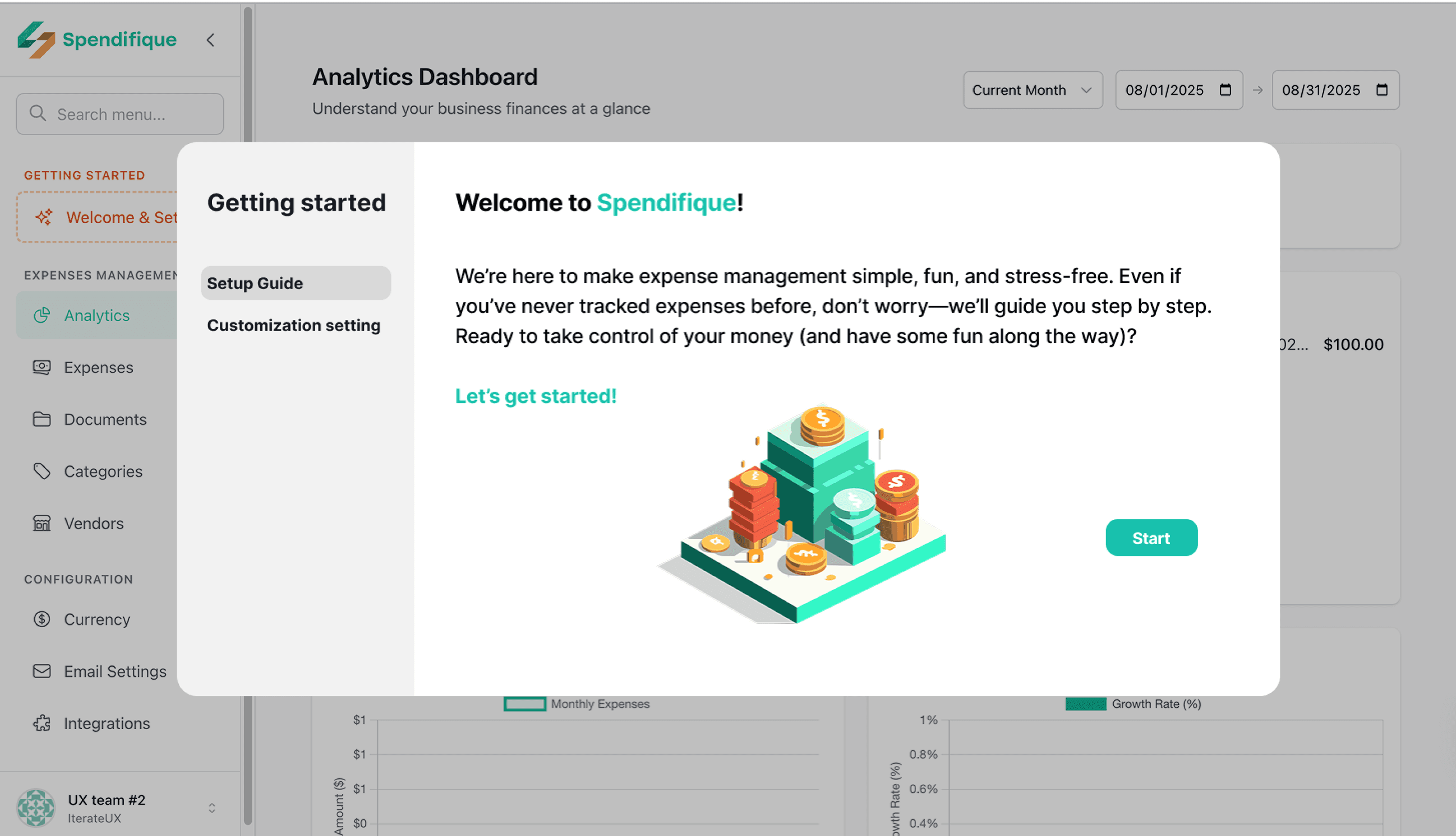
Short cards introduction
It uses short cards to highlight each feature—Navigation bar, Analytics, Community, Peer Benchmarking, and Expense.
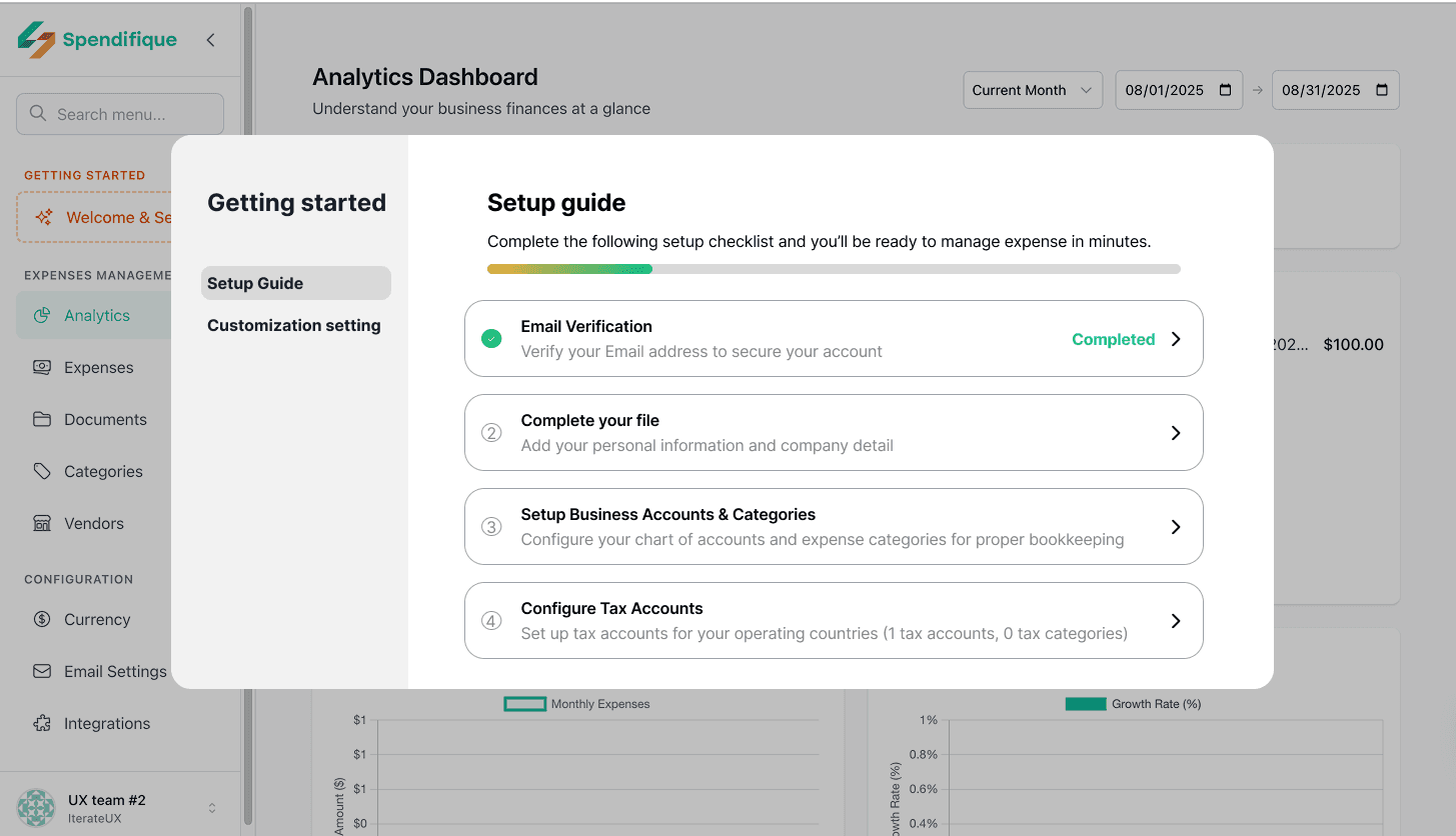
Setup guide
The setup guide leads users through the initial configuration with a clear progress bar. By showing how far they’ve come, it gives users a sense of achievement and helps them stay oriented.
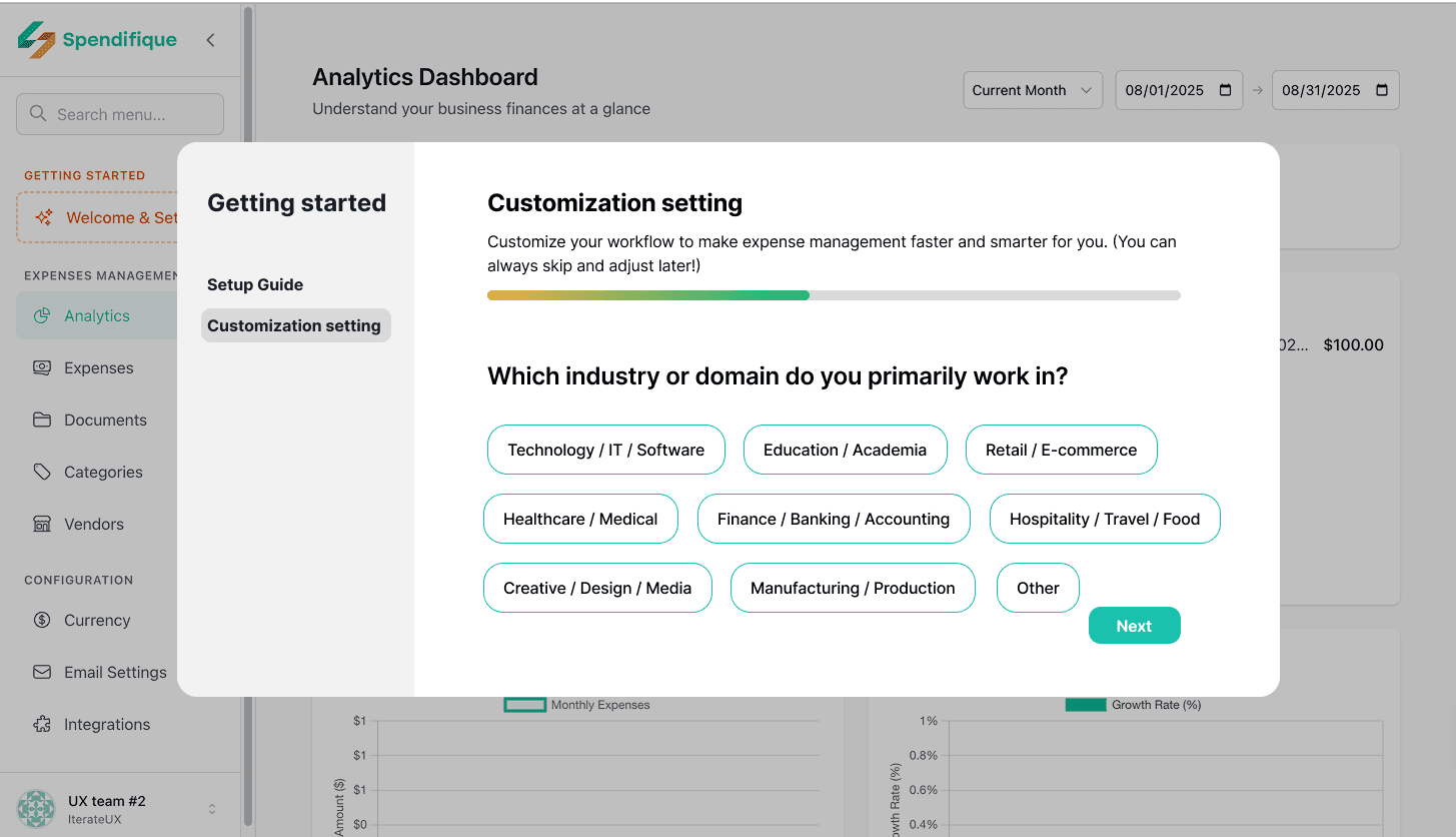
Customization setting
Customization settings allow users to personalize the app according to their identity, goals, and habits.
Questions like “What’s your role?”, “How do you prefer to input expenses?”, “How often do you track spending?”, and “Which industry are you in?” make the experience tailored to their needs.
This personalization not only increases relevance but also builds trust—users feel that Spendifique is a tool designed just for them.

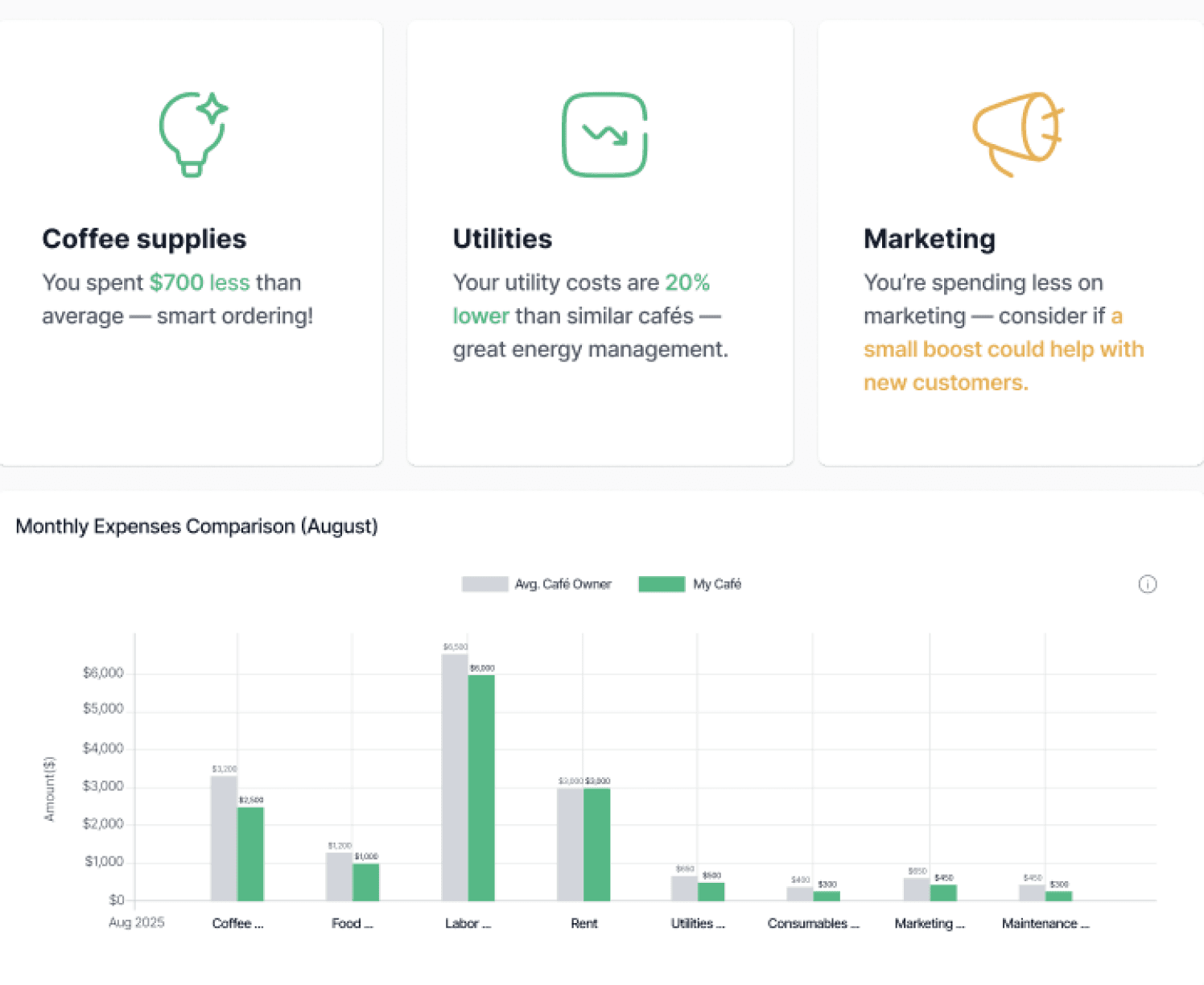
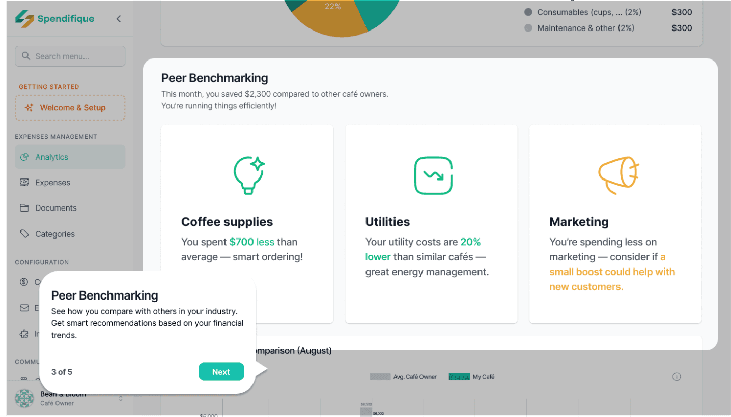
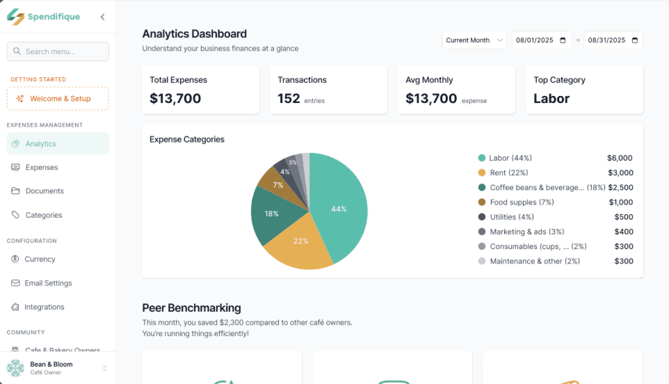
Peer Benchmarking in Analytics
Provides financial overviews with automated benchmarking and infographic-style comparisons. Makes financial performance easy to understand by showing how users compare to industry averages.
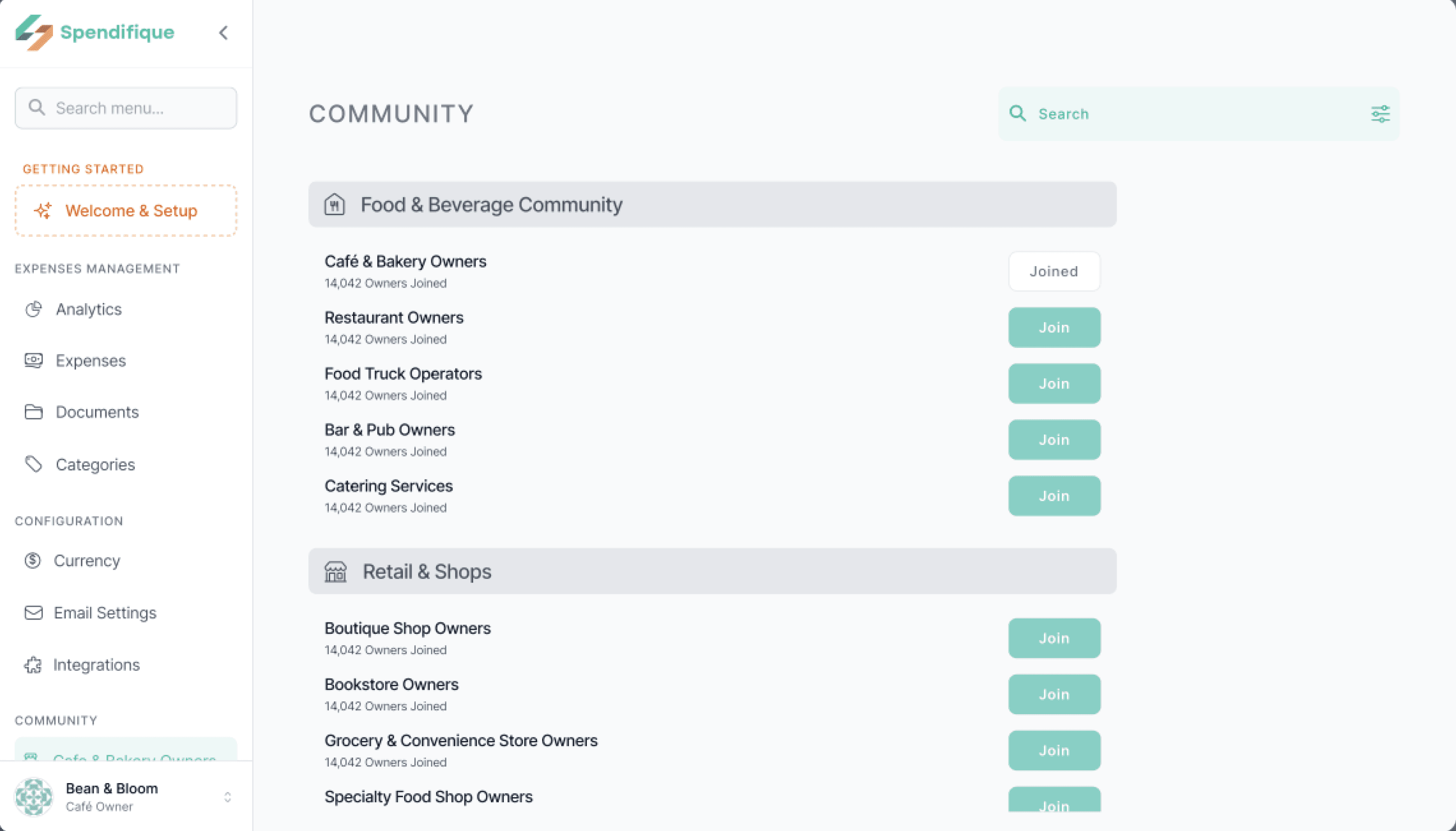
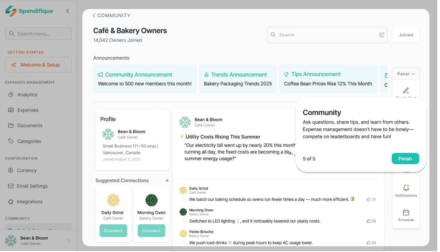
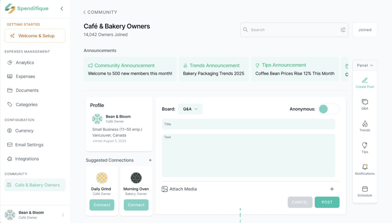
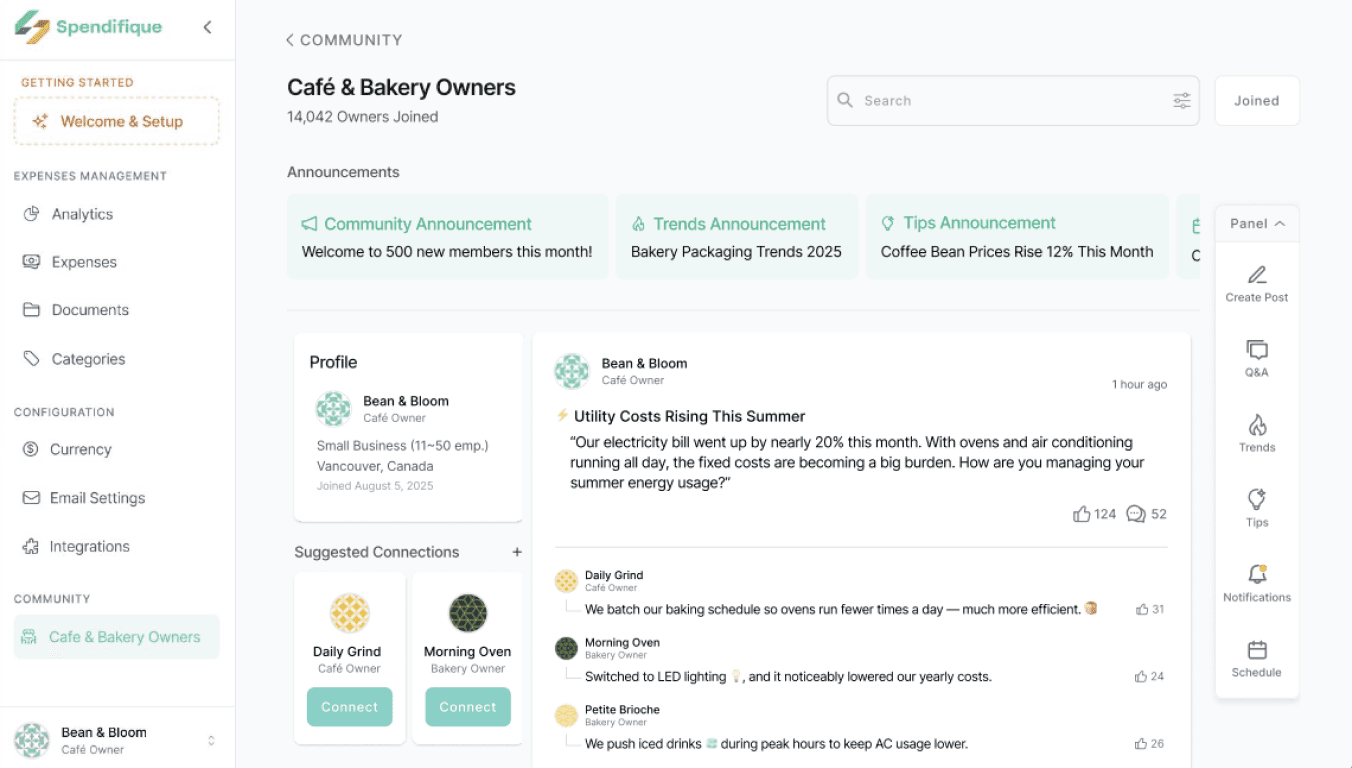
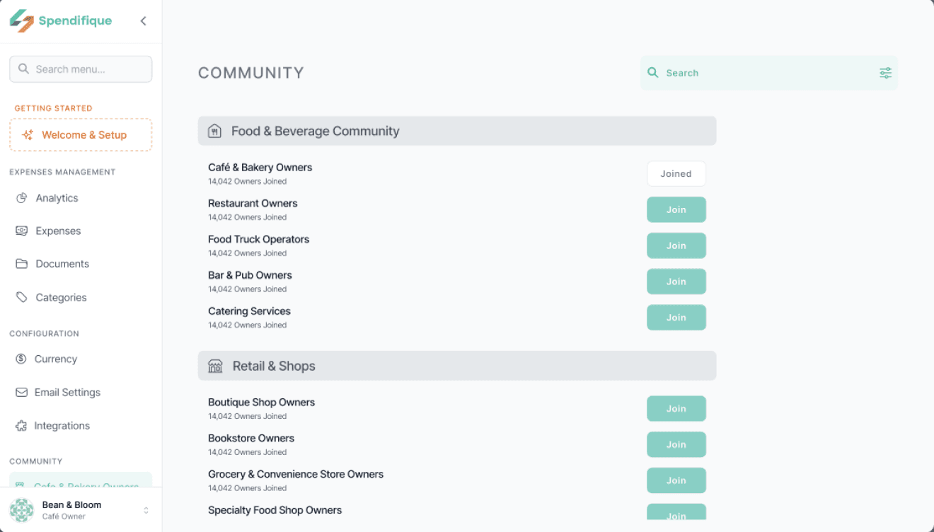
Industry Communities
Organized groups by industry (Cafes, Restaurants, Retail, etc.) with easy join options. Ensures relevant discussions and meaningful benchmarking within specific business contexts.
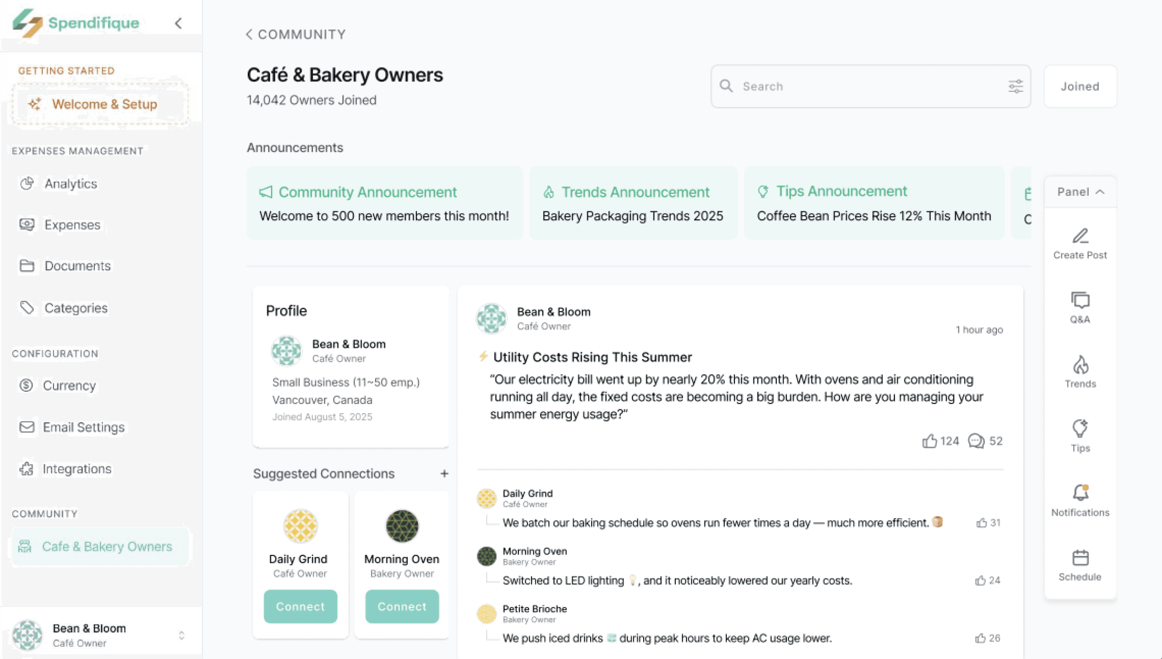
Central page with announcements, posts, and suggested connections tailored to each business type. Keeps users updated, builds a sense of belonging, and fosters contunuous participation
Designed with a simple, clean layout so users can quickly find only the information they need, keeping engagement focused and effortless.
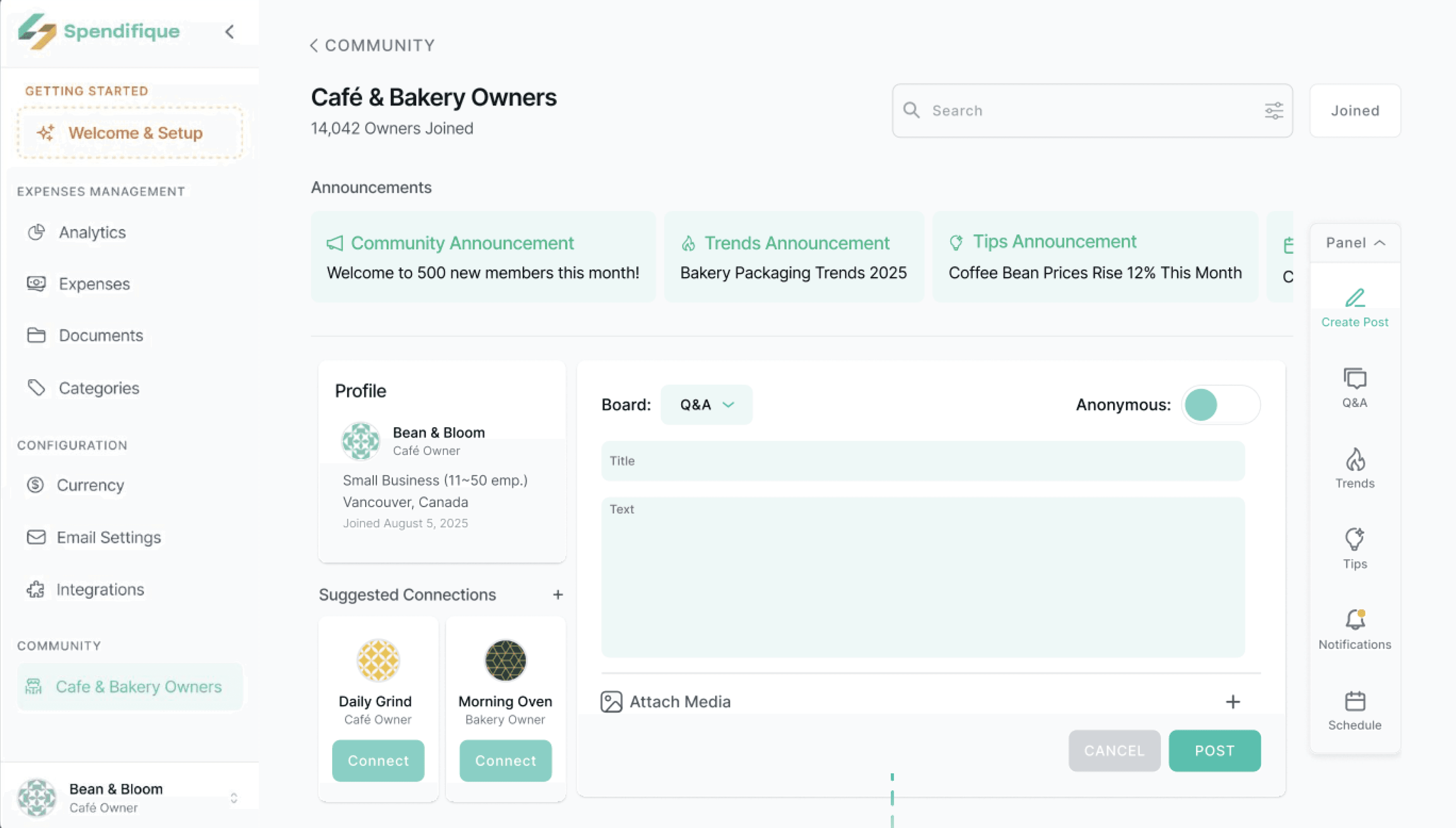
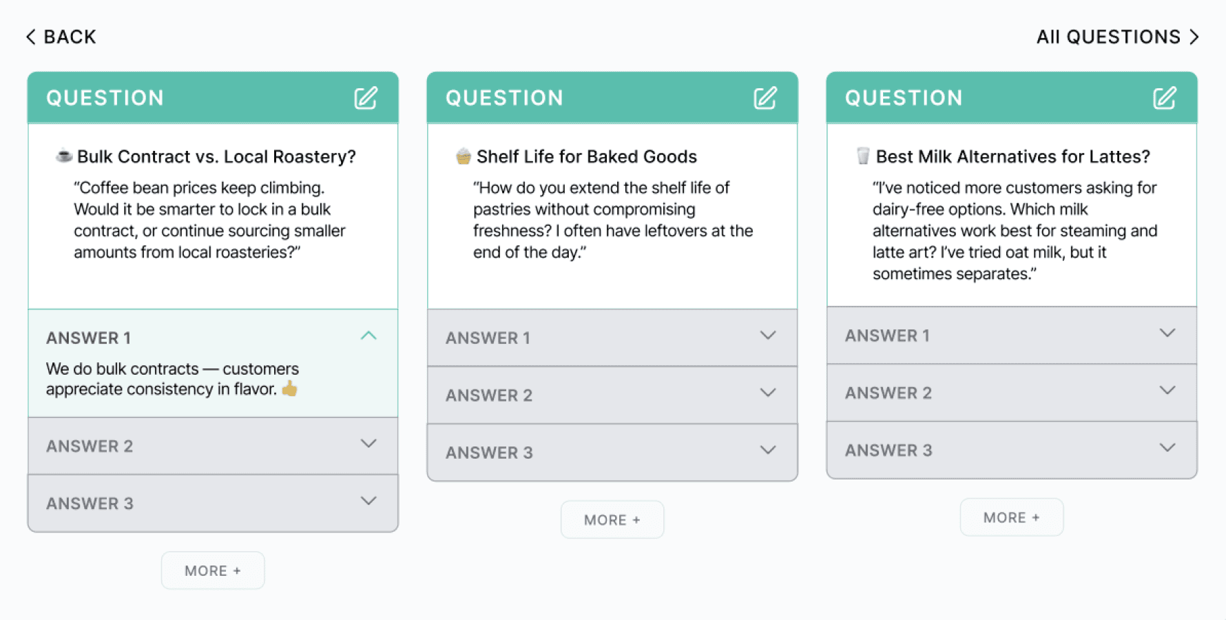
Create Post - Q&A Board
Users can post questions, share experiences, or post anonymously within their community.
Encourages peer learning and reduces isolation by connecting owners with others facing similar challenges.
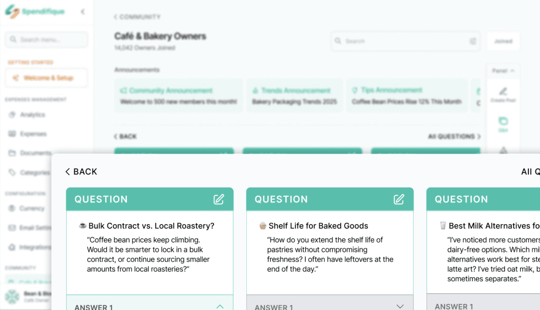
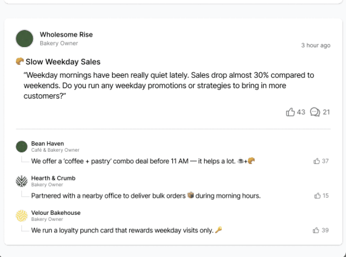
Q&A Discussion Threads
Dedicated Q&A cards with multiple answers on industry-specific topics (e.g. coffee, baking).
Turns individual struggles into collective solutions, offering practical advice from peers.
Learnings & Takeaways
Leading this project deepened my understanding of how strong design outcomes depend on clear ownership, shared understanding, and disciplined decision-making. As the team lead, I translated user research into focused design priorities, helping the team move forward with clarity while keeping the client aligned on scope and goals.
From a design perspective, this project reinforced the value of simplicity and intentional constraint—reducing complexity, prioritizing essential information, and designing workflows that support user confidence rather than overwhelm. Balancing user needs, business goals, and technical limitations sharpened my ability to make thoughtful product decisions and communicate their rationale with clarity and empathy.

Thank you for visiting my portfolio! :)
Copyright © 2026 Tim Tang